> ## Documentation Index
> Fetch the complete documentation index at: https://knowledge.tryjhorizon.com/llms.txt
> Use this file to discover all available pages before exploring further.
# Brand overview
> Review your brand's AI visibility metrics, rankings, and positioning across AI search engines.
The brand overview dashboard is the central analytics hub for your organization. Access it at `/product/{orgId}/dashboard` after selecting your organization.
 ## KPI cards
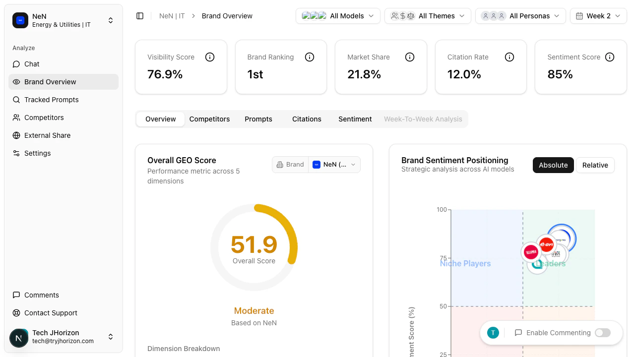
Five KPI cards appear at the top of the dashboard, each summarizing a core metric:
| Card | What it measures |
| -------------------- | ------------------------------------------------------------------------ |
| **Visibility Score** | Your brand's overall presence across AI search engines |
| **Brand Ranking** | Your position among tracked competitors |
| **Market Share** | Percentage of AI mentions your brand receives relative to competitors |
| **Citation Rate** | How frequently AI search engines cite sources when mentioning your brand |
| **Sentiment Score** | Overall perception of your brand in AI-generated responses |
Hover over any KPI card to see a detailed tooltip explaining how the metric is calculated and what it means for your brand.
## KPI cards
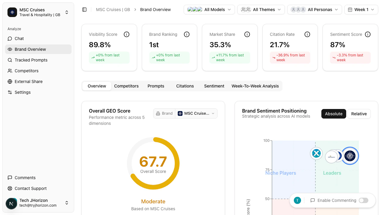
Five KPI cards appear at the top of the dashboard, each summarizing a core metric:
| Card | What it measures |
| -------------------- | ------------------------------------------------------------------------ |
| **Visibility Score** | Your brand's overall presence across AI search engines |
| **Brand Ranking** | Your position among tracked competitors |
| **Market Share** | Percentage of AI mentions your brand receives relative to competitors |
| **Citation Rate** | How frequently AI search engines cite sources when mentioning your brand |
| **Sentiment Score** | Overall perception of your brand in AI-generated responses |
Hover over any KPI card to see a detailed tooltip explaining how the metric is calculated and what it means for your brand.
 ## Overview tab
The **Overview** tab displays several charts and tables that break down your brand's AI visibility:
A donut chart where each segment represents a different geographic market. Each segment shows your brand's visibility score in that region, and larger segments indicate a stronger AI presence. Hover over any segment to see the exact score for that market.
Use the **brand selector** dropdown above the chart to compare GEO scores for different brands. This helps identify regions where competitors outperform you.
A scatter plot where each dot represents a brand — yours and your competitors. The axes plot sentiment dimensions, with higher positions indicating more positive AI perception. Brands in the upper region have more favorable AI mentions.
Look for where your brand clusters relative to competitors to spot sentiment gaps you can address.
Estimated referral traffic volume from AI platforms to your brand, broken down by source platform. Higher values indicate more users are likely being directed to your brand through AI-generated responses.
Compare platforms to prioritize where to focus your content strategy for maximum referral impact.
A heatmap with configurable dimensions — the most flexible visualization on the dashboard. Color intensity indicates performance; darker cells represent higher values. Hover over any cell to see the exact metric value.
Use the **Rows** selector to switch between "Models" and "Brands" views. Use the **Metric** selector to choose which metrics are displayed as columns. This lets you compare any combination of brands or AI models against any set of metrics.
A sortable table with columns for Brand, Visibility Score, Market Share, Citation Rate, GEO Score, Brand Rank, and Sentiment. Click any column header to sort ascending; click again for descending. Your brand is highlighted in the table for easy reference.
A side-by-side metric comparison between your brand and the competitor with the most similar overall profile. Each metric is displayed with both values and the difference between them. Green values indicate where you lead.
Use the **competitor selector** to compare against a different brand instead of the auto-selected closest match.
A bar chart with one bar per AI platform (ChatGPT, Claude, Gemini, Perplexity, etc.). Bar height represents how frequently your brand appears in that platform's responses. Platforms with low presence rates represent opportunities for improvement.
The tracked prompts with the greatest influence on your visibility score, ranked by impact. If high-impact prompts show low brand mention rates, focus on improving your brand's representation for those queries.
Use the **brand filter** dropdown to see which prompts drive visibility for a specific competitor.
Source domains most frequently cited by AI search engines when discussing your brand, ranked by citation frequency. These domains have the most influence on how AI represents your brand to users. Strengthen relationships with positively-citing sources and address negatively-citing ones.
## Overview tab
The **Overview** tab displays several charts and tables that break down your brand's AI visibility:
A donut chart where each segment represents a different geographic market. Each segment shows your brand's visibility score in that region, and larger segments indicate a stronger AI presence. Hover over any segment to see the exact score for that market.
Use the **brand selector** dropdown above the chart to compare GEO scores for different brands. This helps identify regions where competitors outperform you.
A scatter plot where each dot represents a brand — yours and your competitors. The axes plot sentiment dimensions, with higher positions indicating more positive AI perception. Brands in the upper region have more favorable AI mentions.
Look for where your brand clusters relative to competitors to spot sentiment gaps you can address.
Estimated referral traffic volume from AI platforms to your brand, broken down by source platform. Higher values indicate more users are likely being directed to your brand through AI-generated responses.
Compare platforms to prioritize where to focus your content strategy for maximum referral impact.
A heatmap with configurable dimensions — the most flexible visualization on the dashboard. Color intensity indicates performance; darker cells represent higher values. Hover over any cell to see the exact metric value.
Use the **Rows** selector to switch between "Models" and "Brands" views. Use the **Metric** selector to choose which metrics are displayed as columns. This lets you compare any combination of brands or AI models against any set of metrics.
A sortable table with columns for Brand, Visibility Score, Market Share, Citation Rate, GEO Score, Brand Rank, and Sentiment. Click any column header to sort ascending; click again for descending. Your brand is highlighted in the table for easy reference.
A side-by-side metric comparison between your brand and the competitor with the most similar overall profile. Each metric is displayed with both values and the difference between them. Green values indicate where you lead.
Use the **competitor selector** to compare against a different brand instead of the auto-selected closest match.
A bar chart with one bar per AI platform (ChatGPT, Claude, Gemini, Perplexity, etc.). Bar height represents how frequently your brand appears in that platform's responses. Platforms with low presence rates represent opportunities for improvement.
The tracked prompts with the greatest influence on your visibility score, ranked by impact. If high-impact prompts show low brand mention rates, focus on improving your brand's representation for those queries.
Use the **brand filter** dropdown to see which prompts drive visibility for a specific competitor.
Source domains most frequently cited by AI search engines when discussing your brand, ranked by citation frequency. These domains have the most influence on how AI represents your brand to users. Strengthen relationships with positively-citing sources and address negatively-citing ones.
 ## Dashboard tabs
The dashboard has six tabs. The **Overview** tab is described above. The remaining tabs provide focused views:
| Tab | What it shows |
| ------------------------- | -------------------------------------------------------------------------- |
| **Competitors** | Side-by-side metric comparison table for all tracked brands |
| **Prompts** | Performance breakdown by tracked prompt, grouped by theme |
| **Citations** | Source domains cited by AI search engines when discussing your brand |
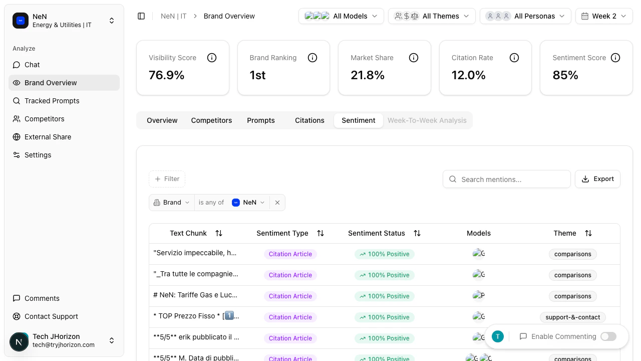
| **Sentiment** | Text-chunk level sentiment analysis of AI-generated responses |
| **Week-to-Week Analysis** | Coming soon — will show trend data comparing metrics across analysis weeks |
The Week-to-Week Analysis tab is currently in development. It will display trend comparisons across analysis weeks when available.
Start with the KPI cards for a high-level health check. If any metric has dropped, drill into the relevant tab (Prompts, Citations, or Sentiment) to understand why. Use the Closest Competitor section to track your relative position week over week.
## Next steps
See how your brand stacks up against the competition.
Refine dashboard data with global filters.
Annotate dashboard charts with your team.
Share dashboard data with external stakeholders.
## Dashboard tabs
The dashboard has six tabs. The **Overview** tab is described above. The remaining tabs provide focused views:
| Tab | What it shows |
| ------------------------- | -------------------------------------------------------------------------- |
| **Competitors** | Side-by-side metric comparison table for all tracked brands |
| **Prompts** | Performance breakdown by tracked prompt, grouped by theme |
| **Citations** | Source domains cited by AI search engines when discussing your brand |
| **Sentiment** | Text-chunk level sentiment analysis of AI-generated responses |
| **Week-to-Week Analysis** | Coming soon — will show trend data comparing metrics across analysis weeks |
The Week-to-Week Analysis tab is currently in development. It will display trend comparisons across analysis weeks when available.
Start with the KPI cards for a high-level health check. If any metric has dropped, drill into the relevant tab (Prompts, Citations, or Sentiment) to understand why. Use the Closest Competitor section to track your relative position week over week.
## Next steps
See how your brand stacks up against the competition.
Refine dashboard data with global filters.
Annotate dashboard charts with your team.
Share dashboard data with external stakeholders.